Brighter Sound are a Manchester-based music charity with a passion and expertise in developing musicians and music enthusiasts at every stage of their journey. They approached us at a very exciting time, just after undergoing a re-brand, and they needed a web presence that felt much more representative of them and the people they support.
Brighter Sound
A dynamic website to showcase a new, bold identity for Manchester-based music charity, Brighter Sound.
Persona informed
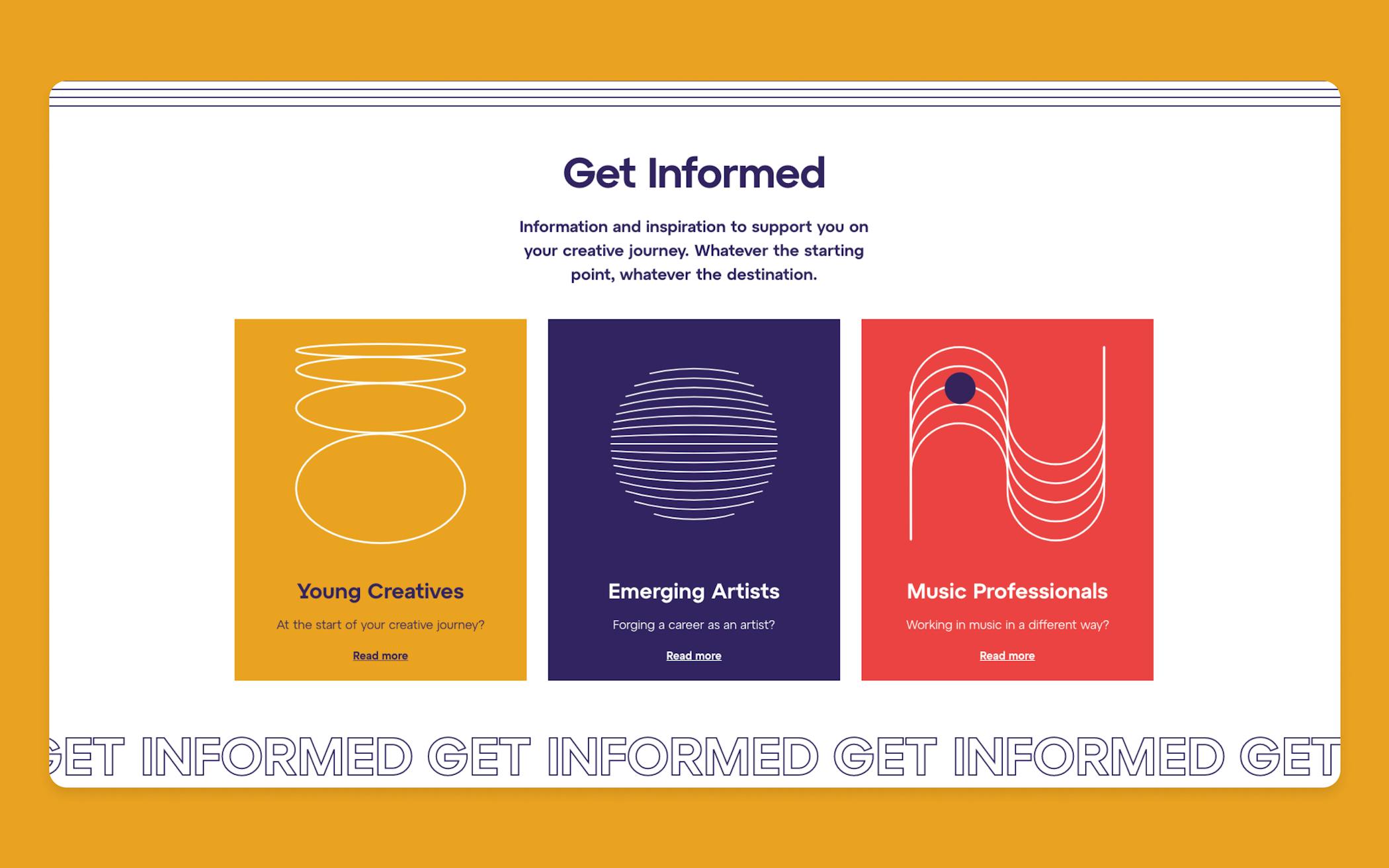
Three specific user journeys for Young Creatives, Emerging Artists and Music Professionals.
Digital facing brand
Vibrant illustrations and animations that added a new dynamism to the Brighter Sound brand.
Integrated CRM
Cutting out extra admin and allowing a direct link between the new website and Brighter Sound’s CRM system.
Two-way conversation
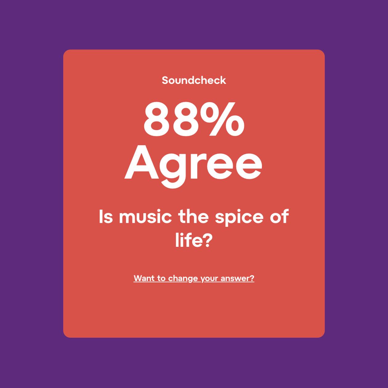
A way for users to influence Brighter Sound’s upcoming content via ‘Soundchecks’.
Brighter Sound
The brief

Digital facing brand
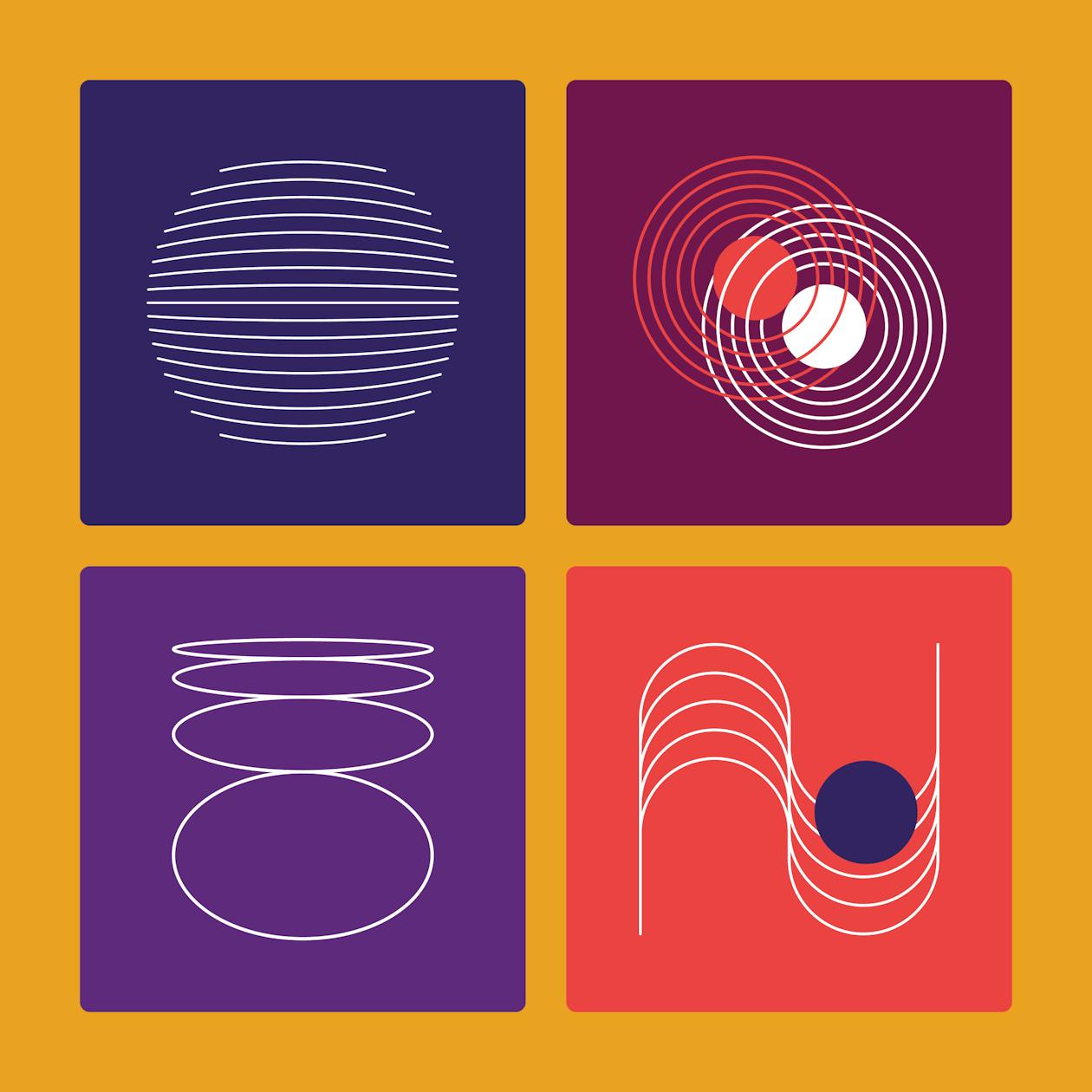
Brighter Sound’s new brand was exciting, dynamic and much more representative of them as an organisation — and we knew we could help to push it further in the digital space. Alongside the build we developed a suite of illustrations and animations that took nods from the music world and brought their personality to life. The illustrations gave Brighter Sound the option to not solely use photography across the site, as sometimes this wouldn’t be appropriate. They had flexibility and the ability to use their new illustrations and animations across social content too.
Who are we speaking to?
The first port of call — who are we speaking to and what are they looking for from this website? We ran a UX workshop with core members of the Brighter Sound team and their collaborators to define our audience. Given that Brighter Sound work with such a broad range of people, ages and needs, it was important for us to hone this down to a core group of personas, so that we weren’t trying (and failing) to speak to everyone.
From our session, we reached three primary personas: Young Creatives, Emerging Artists and Music Professionals. They became integral to our decision making, and there are now three dedicated areas of the site for each of these personas to access relevant content, events and resources that speak directly to them.
A modular build
Flexibility was a key focus across the back-end of the site too. We made sure that Brighter Sound weren’t locked into a set of fixed templates determined by the content management system, but they had the ability to choose from a list of building blocks (or modules), allowing them to build pages out based on individual requirements. The modules were designed to work together, in any order, and could be swapped around or changed if new content became available to use.

Two-way conversation
Brighter Sound weren’t looking for one way traffic — they wanted a way to genuinely communicate with their audience, inviting them to have an impact on upcoming events, resources and content. We developed a fun, interactive module called a ‘Soundcheck’, a chance for users to answer polls or questions that Brighter Sound could then use to understand opinions and use these to influence their wider programme.

Integrated CRM
Brighter Sound were also looking for a seamless way to integrate certain functionality of the site with their CRM system. We worked with them to ensure that making donations and applying for call-outs or vacancies was a much more direct process, cutting out time-consuming admin for their team.
Accessibility
As ever, accessibility was front of mind for this project and it was also a key requirement from the original brief. Inclusivity is such a core value of Brighter Sound and the site needed to reflect that in every interaction. We underwent regular accessibility testing throughout the design and build process, making sure that users with specific needs and built-in tools would be able to access content easily and clearly.
Let’s talk about your next project